
My initial idea was to produce a tabloid newspaper that would be accompanied by two supplements. The newspaper would contain all the basic information, contact details and CV. The first supplement would contain examples of my work and the second supplement would contain information about me and my interests.
Having looked at a lot of video interviews with creatives, I really wanted to produce a video to use in my presentation. This would also provide the opportunity to learn how to use the cameras and software used to record and edit film.
The examples of interviews that I have been watching are found on The ABC blog on the Hardy Amies website _ http://hardyamies.com/abc/
Although these are predominantly fashion based it was the concept and style I really liked.
This was all something I planned to do over Easter. I went to the Audio Visual department in College and was given a session on how to use the Sony Handycam and Adobe Premiere. I hired out all the equipment, Handycam, tripod, charger and cable with the intention of writing and filming my interview whilst I was at home over Easter.
I wanted to film it at home as I have recently refurbished my room and it is exactly how I want it. It is a place I feel creative as well as relaxed and as this is PPP I though it relevant to film here. As well as the interview, I wanted footage of me in my favourite places. This could be edited in/over the interview to give an impression of me as a person as well as a designer.
The interview would consist of answers to questions about me, about my life, about my work, my interests/influences and what I want to achieve in life.
Unfortunately I let some personal issues get in the way of my work over Easter, which meant I did not achieve what I wanted too and therefore needed to rethink my outcome for this project. This meant that I did not have the time nor the locations to film and I also had ran out of time to get my newspapers professionally printed.
The videoing is still something I am really interested in and is something I want to experiment and develop over the summer.
My alternative option was to downscale my newspaper and supplements into a booklet and packaging for that, as well as a cover letter, business card and CV.
To start my branding I needed a focal point and for me this is my name. Although I thought about all my attributes and qualities it was my name that stood out. 'Jasper' is not a completely unique name, however, it is not the most common name and therefore quite interesting.
I had sketched a few logos very roughly as soon as we had been set the brief.

I chose to produce a type based logo as these are the type of logos I like and like designing so it was therefore appropriate that my branding should be such.
With these initial ideas I used my handwriting as a major influence whilst also experimenting with some drawn type. I also looked into the letters in my name and how I could use these.
None of these ideas were taken any further, however, the logo on lines 9-10 slightly resembles the final idea.
When I revisited the project I sketched out some more logo ideas.

I had thought about using an existing typeface, however, from these ideas I decided I wanted to use my own typeface. I am a very precise person so I used graph paper to draw out my logo.
I did this twice as there were incorrect elements in the first attempt that meant the logo did not work aesthetically in some areas.

Once the design had been finalised on paper I needed to draw it digitally so that it could be used across all my branding and identity.
I chose to make the 'Jasper' in a heavier point size was because I wanted this to be the stand out feature. The line break was used as a gradient between the heavy point and the light point as it is a medium weight.

There is no specific reason why I chose to break my name up with a line, it is just something I have seen and experimented with before but never actually used. I therefore thought this was a good time to use it.
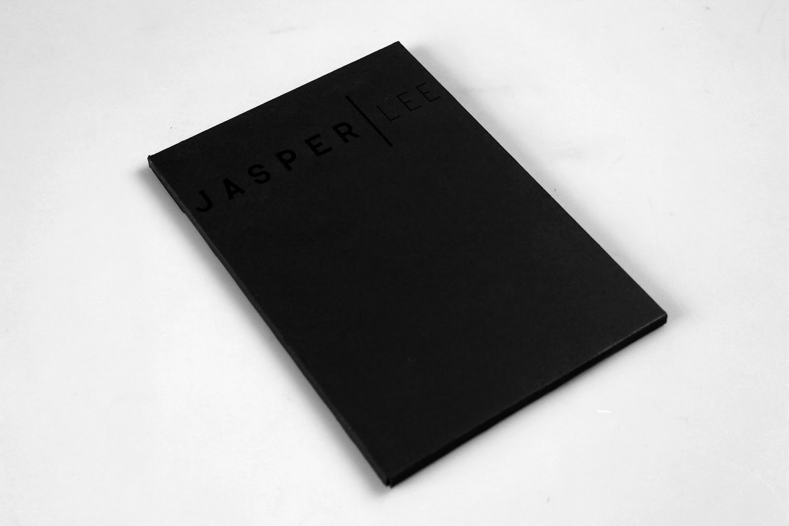
At this point I hadn't really decided any other elements of my visual identity, however, it was at this point that I decided I wanted to use black stock. I chose to do this as I think black on black is very striking, sophisticated, interesting, chic, a bit audacious, confident, etc. all qualities I think I possess.
Obviously not all of my work could be printed on black as a lot of information can be lost when printing on black stock.
The item I really wanted in black stock were my business cards. These are the was people remember who you are and refer to you when you are not there., This means they need to have impact be memorable and remind the person of me.
The design for my business cards was very simple. The front of the business cards consists of my logo and the rear has my name, occupation, mobile number and email on. The information on the back is also enclosed in two lines to emulate the line in the logo.


The fonts used throughout my branding are Helvetica Regular and Helvetica Bold.
The business cards were now ready to be printed and cut down to size.
I then moved onto the other elements of the pack, specifically the booklet.
I wanted this to allow the reader to get to know me as a person, as a designer, my interests, my work and my aims.
I have recently got quite into perfect binding so wanted to bind my booklet in such a manner. I also wanted to cover to be the same stock as the business cards, however the content stock needed to be white so that you could see and read all of the information.
As there were to be printed on two separate stocks, I designed them as two separate files.
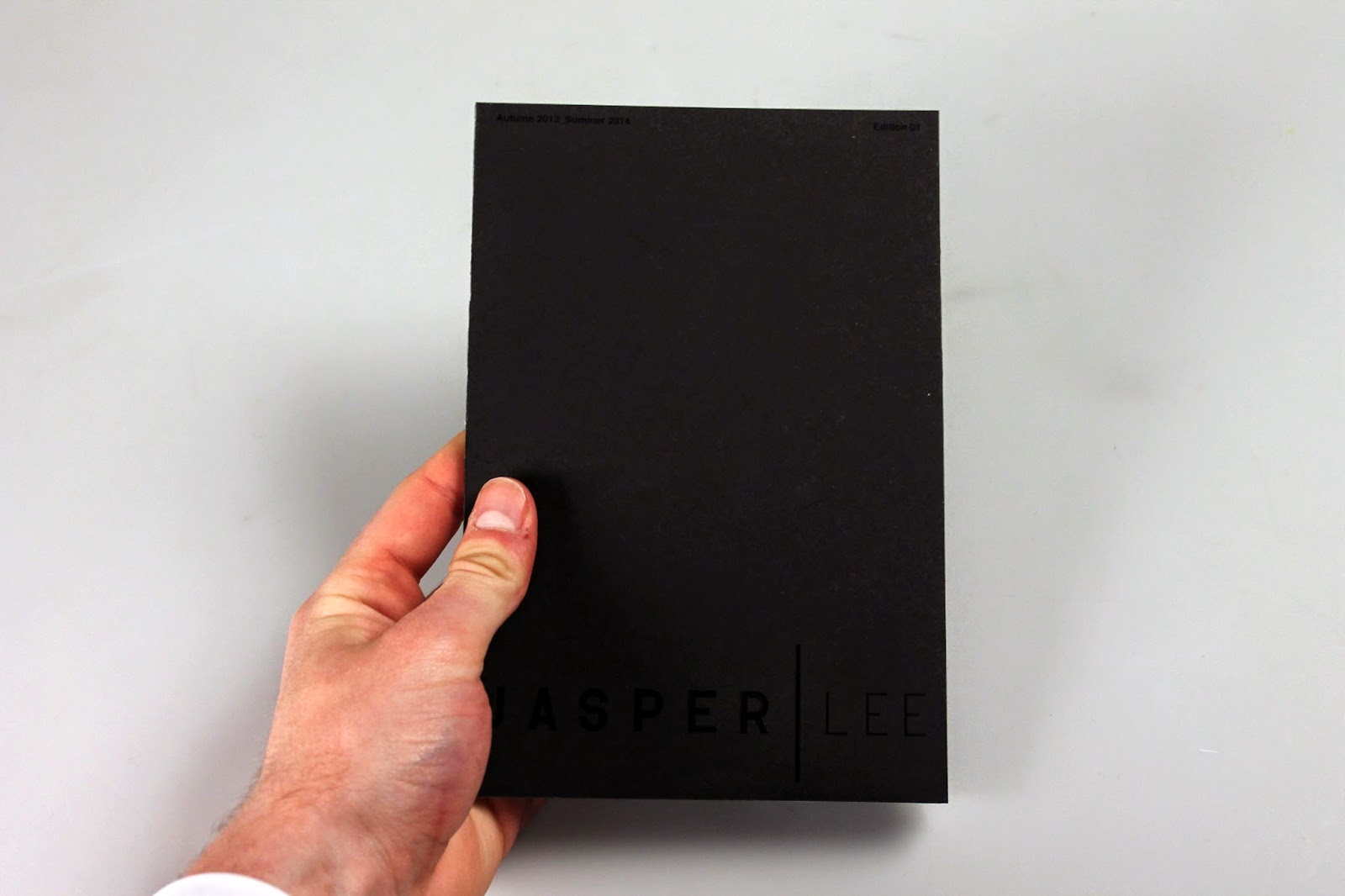
The cover included my logo, date and edition as I wanted it to develop and increase in editions as I grow as a designer. On the back it also has my contact details just as another point of reference.
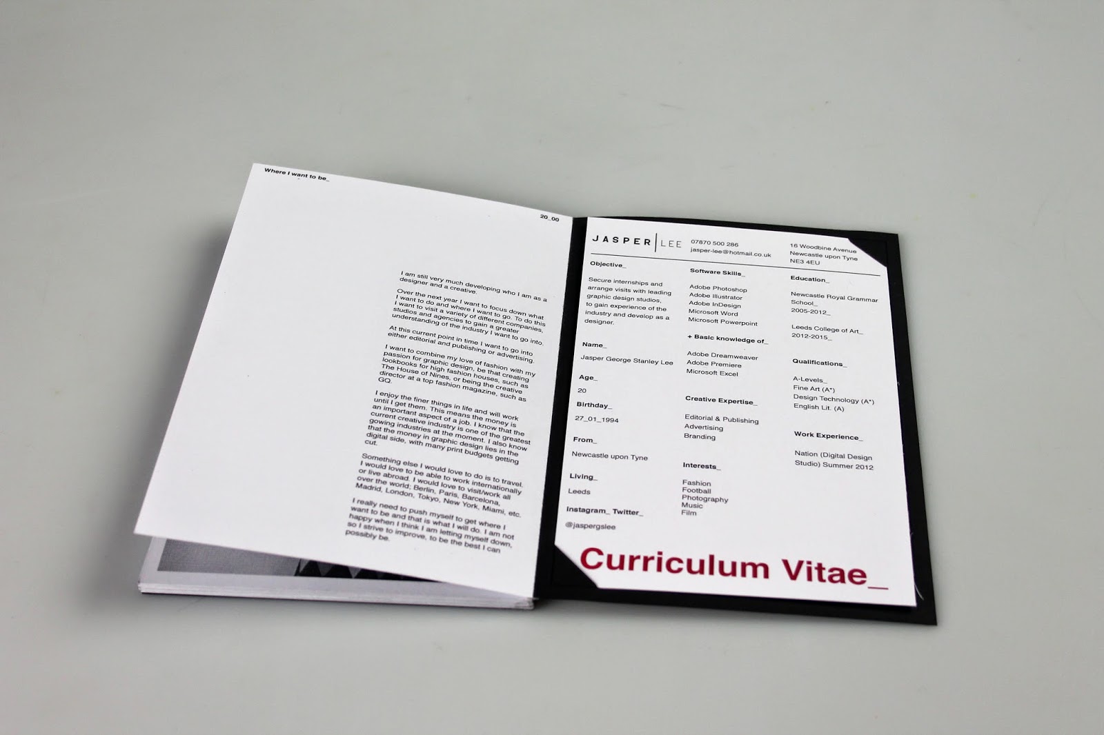
The inside of the cover contains the contents and space for my CV.
I initially wanted to have the booklet at quite a large scale, however with the binding method I wanted to use, I wasn't sure this was going to be possible. I downsized the publication to 132mm x 195mm. This size is easy to hold and read, the binding will secure this size well and it is easier to post.
Cover Layout_


The CV was to be printed on a separate stock and attached to the rear of the publication.
Once the cover had been designed I turned my thoughts to the contents of the booklet. I started out by planning what was going where.


The first page was about me so I also decided on the information I should put on that page.
Publication Content_


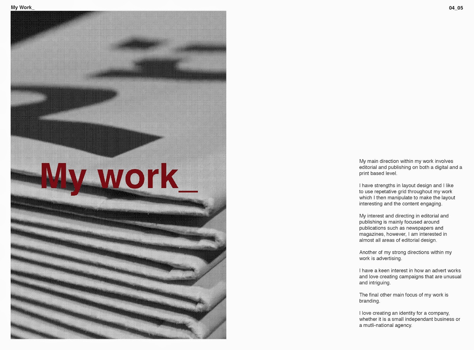


I wanted the design of the publication to reflect how I design and how I want to design in the future. I also wanted to show the variety of skills I have.
To accompany the publication and to be held on the inside back cover I produced a CV.
I wanted to include all the key information and skills I possess as well as my objective for sending this pack out.

The red was chosen and used throughout my branding to break up the black and white and in places give an overprint feel.
The content of the publication and my CV were printed on white stock so that all the information was easily visible and readable.
The final element that would be included in my back is a cover letter. The letter would be personal to the studio/agency and just explain to them what I am doing and what I would like from them.

Now the content of the pack had been designed, I focused on the design of the packaging. I did not want overly extravagant packaging as I don't think the contents warranted it and I don't think it was a good reflection of me.
I wanted to produce a smart sturdy envelope that had to me torn along a perforated edge to be opened. I also wanted the envelope in the same stock as the business cards and the cover of the publication.
I designed a net using the dimensions of the publication and the estimated depth of the publication.

Once all of the separate elements had been designed, I could now print, bind and finish off the pack. In terms of finishing, most of it was just cutting down to size, however the publication needed binding and the packaging needed constructing.
Perfect Binding_
I cut the pages of my publication roughly down to size, put them in the correct order and aligned them to the left so the spine was flat. I also added scrap paper and mountboard of the same size to either side of my publication to prevent any damage from the press and the glue.
Once all prepared I loaded the publication into a pinch press and roughed up the spine using sandpaper. This makes the paper more porous and more likely to absorb the glue.


I then applied glue in thin layers as this way gives the strongest and most reliable bind. I repeated this process several times until I was happy that the glue spine would be strong enough to hold the pages together.
I chose not to use the netting that reinforces the spine as this was not the type of aesthetic I was looking for.
With everything printed and cut out it was now ready to be sealed and sent off to studios and agencies.
On top of my printed promotional pack, I also wanted a digital online presence. for this I had several different options. The options were; one, design and code a website fully using the skills I have learned over this year. Two, use a platform such as Cargo Creative or Droplr, both of which provide completely adjustable templates for the you to manipulate how you like. The third option was just proposing my website, creating the design and mocking it up.
I am not confident in my coding ability and did not have the time to fully code a website to the quality I would like.
I am currently setting up a Cargo Creative site for a fashion student. He has applied for the space but has not heard back yet, due to my time limitations this was also not a plausible option.
This left me with one choice. Although I would have much preferred to have a fully working website - something I can work on over the summer - this was the best option to show how it would look.

My design is a very simple grid system, using six columns and 4 rows. The homepage has links to all of the pages on the website, as well as visual links to my work as soon as you click on the site.

My about page contained all relevant informaion about myself; A short introduction, my basic information (name/age/birthday/from/living), my software skills, creative expertise, interests, where I was educated, my qualifications and where I have done my work experience.

The contact page is extremely basic, only containing the information needed to contact me or connect with me.

Once a work page is clicked on the work associated to that area will appear in a grid identical to the homepage. These, like on the homepage, would act as roll over buttons so that when the user's mouse hovered over the image it would tell you the title and date of the work.


Once in a page and clicked on a project, it would appear like this. A selection of photos in various, changeable sizes within the grid as well as some information on the project.
As well as the work pages, contact page and about page, I also included a personal page and twitter and instagram pages. The personal page would show self driven work that I have done that isn't for clients. The twitter and instagram pages would just be a feed from my accounts on both platforms.
Mock ups_


I also mocked up how my brand could be spread across a wide range of printed matter and stationary. I did not actually produce any of these elements as I thought for a promotional pack to send out to studios and agencies they were not applicable.


Publication Content_


No comments:
Post a Comment